
Lets talk about design. Now I’m not talking about game design (mechanics, replay value, theme, etc…), but graphic design. The visual elements you see when you pick that box off the shelf or flip through the rule book. Whether you know it or not, graphic designers and artists (not always the same person) are an integral part of creating the games we love and play.
As someone who’s worked for the better part of two decades as a graphic designer and creative director, I love that I can still be wowed by games even after owning hundreds of them. So today, I want to point out some of my favorites, my Top Ten Games with Great Design.
Before we jump into the list, I need to set a few ground rules. We are looking at games as a whole with respect to its graphic design, not solely illustration/artwork. So while the artwork will definitely factor into the rankings, just having outstanding artwork on the cover of the box isn’t necessarily going to cut it. I want something that presents a unified theme from box to components.
I’m also going to try to keep my summaries brief for brevity’s sake, just calling out the high points I see. I could probably write an entire article on each of the games, as they all offer many unique and interesting qualities. But we’ll save that for another time.
Finally, I’m going to do my best to call out the artists and designers for each game on the list. However it’s not always easy to find out who they are. So if you know of someone that’s missing from a game’s credits, please let me know. So with that out of the way, let’s get to it.
Top 10 Games with Great Design
10. Lords of Waterdeep (review)
 Lords of Waterdeep is a worker placement game set in the Dungeons and Dragons universe of Forgotten Realms. One of the great things about Lords of Waterdeep is how the box was made to look like an old DnD handbook. It has a unique design that really takes me back to my days of playing a weekly RPG.
Inside, the game board is presented to look like a map of the city of Waterdeep and the game features loads of thematic art. The only reason Lords of Waterdeep isn’t higher on this list is because they cheaped out and used generic wooden cubes to represent the adventurers. I’ve since replaced mine with DnD Meepes.

Art Director: Keven Smith • Graphic Design: Emi Tanji • Illustrations: Various
2-5 Players • Ages 12+ • 90 minutes • $37
9. Robinson Crusoe: Adventures on the Cursed Island – Voyage of the Beagle
 This expansion to the popular cooperative board game Robinson Crusoe contains several new scenarios that are linked together to form a campaign. What first caught my eye was the box shaped to look like an old novel. This was a great approach, especially for the campaign aspect of the game. The designers further reinforced this once you get into the components.
My favorite part is the scenario book which looks like an old field research notebook (it even has Charles Darwin’s name on the cover). Being an expansion, the designer still had to make sure the components fit with the base game, yet he was still able to give the expansion its own unique feel.

Graphic Design: Maciej Mutwil • Illustrations: Barbara Trela-Szyma, Karolina Węcka, Mateusz Bielski, Mariusz Gandzel
1-4 Players • Ages 8+ • 90 minutes • $30
8. The Gallerist
 The Gallerist is a new game where players take on the role of an art dealer, museum curator, and artists’ manager in a heavy euro game. Being about the world of art, I had high expectations for The Gallerist. Overall I was very pleased and thought that the designer did a great job with the box. It cleverly looks like a magazine holder that contains a few issues of various art magazines. I thought that this was a great touch that really helped reinforce the theme of the game.
Inside, the components for The Gallerist are designed quite well. There is quite a lot of information that needs to be presented, but they are still done in both a logical and thematic manner. The game board features a large map of a museum campus, with other boards containing blank walls waiting for artwork. What really tied the whole package together were the tiny easels that hold artwork during the game.
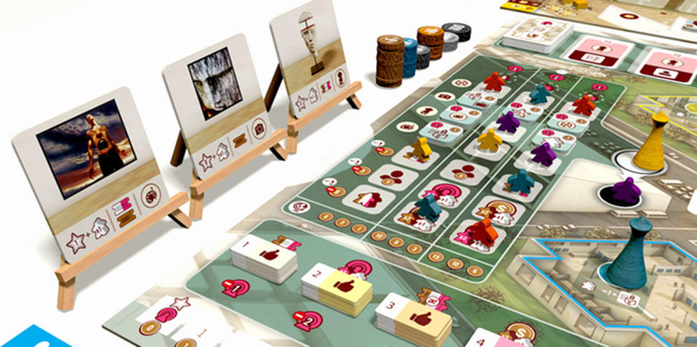
Graphic Design and Illustrations: Ian O´Toole
1-4 Players • Ages 12+ • 120 minutes • $80
7. CO2
 One wouldn’t think you could make a game about smog and pollution beautiful, but they succeeded with CO2. The cover of the box draws you in with it’s abstract painting of a factory beautifully polluting the white background of the box. It’s attractive and disturbing at the same time.
Inside, the game board shows an abstract representation of the globe, with many trackers surrounding it. Once again, this is all together quite well executed with some thematic pollution designs. Each of the building tiles are similarity illustrated and I liked the flat nature of the illustrations. Thematically, I really felt that the pollution theme was driven home here, and the great design of the board and components helped make CO2, a heavy euro, easier to play.

Illustrations: Giacomo Tappainer and Paula Simonetti
1-5 Players • Ages 12+ • 120 minutes • $45
6. Yardmaster
 There is no shortage of train games, with this theme having been around for decades. Yet I really liked the creative direction the designer of Yardmaster took. The game box shows a simple silhouette of an engine in motion, upon a stark orange background. I really enjoyed this minimalist approach, which was continued throughout each of the cards in the game. This helps to not only create a unified package, but the shift in colors on the cards help to quickly be able to categorize the card you are playing. Yardmaster proves that you don’t need a highly detailed illustration to still make a striking and visually appealing game.

Graphic Design: Darrell Louder • Art: Dan Thompson
2-5 Players • Ages 8+ • 20 minutes • $20
5. Glory to Rome Black Box (review)
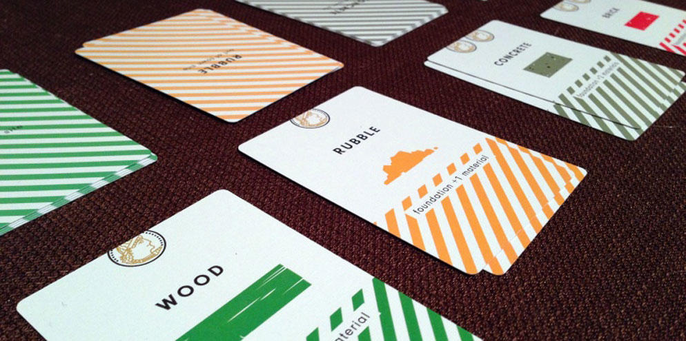
 There have been more than a few versions of Glory to Rome over the years, but the Black Box has always been my favorite. The box features a while Roman eagle on a solid black background. The only color is the red banner pronouncing the game’s name. It’s a visually appealing dynamic that provides little information but still grabs your attention.
Inside, the cards help continue the game’s abstract approach with its unique iconography. I like the flat style of the artwork, and how the artist used colors to act as a guide to the cards function. The Glory to Rome Black Box has a bit of a checkered history and has long since gone out of print, but it will still remain my favorite version of the game.
 Graphic Design and Art: Heiko Günther
2-5 Players • Ages 12+ • 60 minutes • Out of Print
4. Cthulhu Wars (review)
 Good things may come in small packages but sometimes great things come in large boxes. The first thing you will notice about Cthulhu Wars is the massive size of the box. But what’s really great about the packaging is that the designer was able to restrain himself from using all that available real-estate. Instead, he took a more minimal approach and let the scale of the box speak for itself. The starkness of the cover is only broken up by the game’s logo with 4 outstanding pieces of artwork, one for each of the game’s four factions. I can almost get a feeling of a giant black monolith when looking at the box.
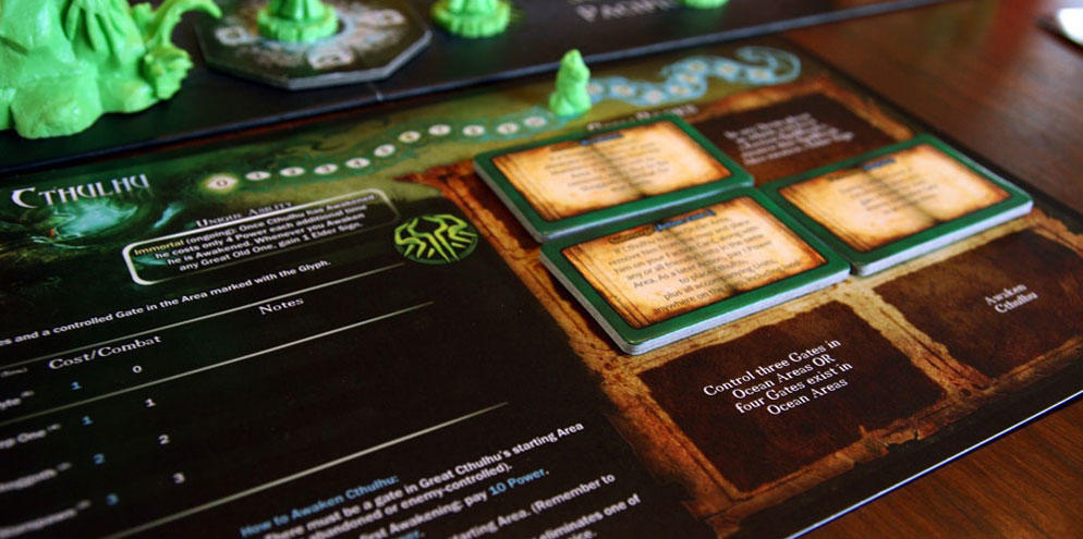
When opening up the Cthulhu Wars box, players will not be disappointed in what they find. Miniatures galore with some of the largest, most exciting miniatures to ever grace you tabletop. While the miniatures will steal the show, even the faction sheets are well done, being both useful from a gameplay standpoint and also expertly laid out. The spell book tokens are illustrated to look like books and the game board has an almost primeval feel to it with the somewhat surreal nature of the territories.
 Art Direction, Game Layout & Illustration: Rich Fleider • Art: Richard Luong
2-4 Players • Ages 12+ • 90 minutes • $150
3. TIME Stories (review)
 TIME Stories stark white box simply portrays the name of the game and an unusual looking piece of artwork. Is it a robot? A helmet? I’m not sure, but I know that I really like this cover. It has an almost futuristic feel to it that fits the game quite well. Inside, the white game board is full of lines, boxes, and symbols that further reinforce this feeling. Which is perfect for a game where you are playing a member of a temporal agency.
Once you dive into the remaining components in TIME Stories, they come in two flavors. The components for the mission come in the form of a few decks of cards, all which feature fantastic illustrations, the most notable of which is a series of panoramas players will be exploring throughout the game. The components that are used in each game, all match the look and feel of the game board with their abstract, stark white nature. The panoramas are all illustrated in a way to make you feel like you are actually on location at the site.
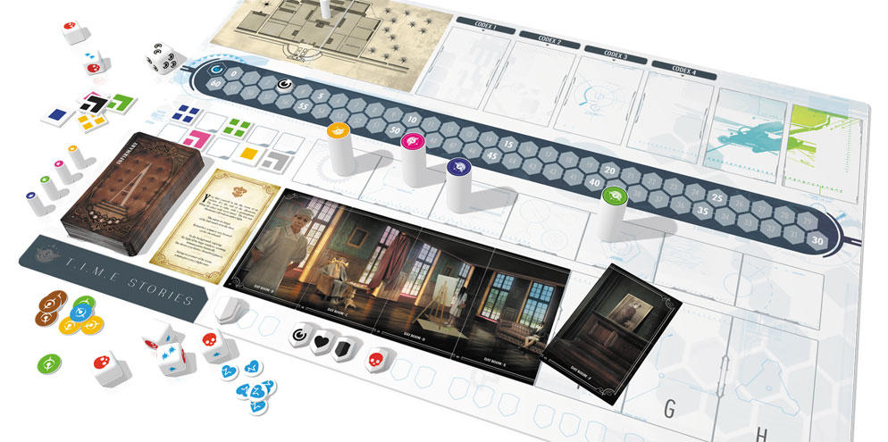
Design: Space Cowboys Studio • Box Art: Pascal Quidault
2-4 Players • Ages 12+ • 60 minutes to play • $37
2. Tokaido (review)
 I remember walking past a copy of Tokaido setup at Gen Con many years ago and thinking to myself that I have to find out more about this game. The cover of the box features a simple white background with a colorful illustration done by one of my favorite game artists, Naiade. The artwork seems to work in perfect harmony with the bareness of the rest of the cover. And when it comes to Tokaido, harmony is what you really want.
Inside, the game board takes players on a zen-like journey from Kyoto to Edo, which is what the game is all about. With Tokaido, you don’t want crazy-in-your-face art and design. You want it to be serene, simple, and it should almost take a back seat to the other elements of the game. If there were ever a game about relaxing, taking your time, and enjoying the journey, it’s Tokaido. From the beautiful panoramas you are collecting, to the creative iconography on the game board, Tokiado just soothes you into a lull as you gaze across the board. I feel like the art and design perfectly captures the spirit of Tokaido.
 Graphic Design: Funforge Studio • Art: Naïade
2-5 Players • Ages 8+ • 45 minutes to play • $30
1. Tomorrow
 Finally, we come to Tomorrow. My absolute favorite game when it comes to layout and design. It all begins with the game box, a black square with a hint of a world map shown under a soft glow. What’s interesting is that the designer didn’t even put the game’s name on the cover of the box. Instead we are presented with two universally recognized symbols of danger: Biohazard and Nuclear. While this move could be considered risky, it absolutely payed off in my opinion, as I immediately want to know more.
Once you get to the contents, you are treated with a nice mix of minimalist and thematic pieces. The game board is plain grey with a flat look to it. It really portrays the feelings of desperation and desolation that this game is themed around. This is immediately contrasted by the bright and colorful population pawns on the game board which create a striking duality that I rarely see in tabletop games. The pawns make the game board look much more depressing, while the board makes the population look even more vibrant in comparison. The rulebook and cards are all illustrated with a more traditional approach, which I feel like they’ve been pulled from some secret government files. Tomorrow has really set the bar high for creating an amazingly designed board game. It’s fully tied together into one cohesive unit, with its own very unique look and feel.
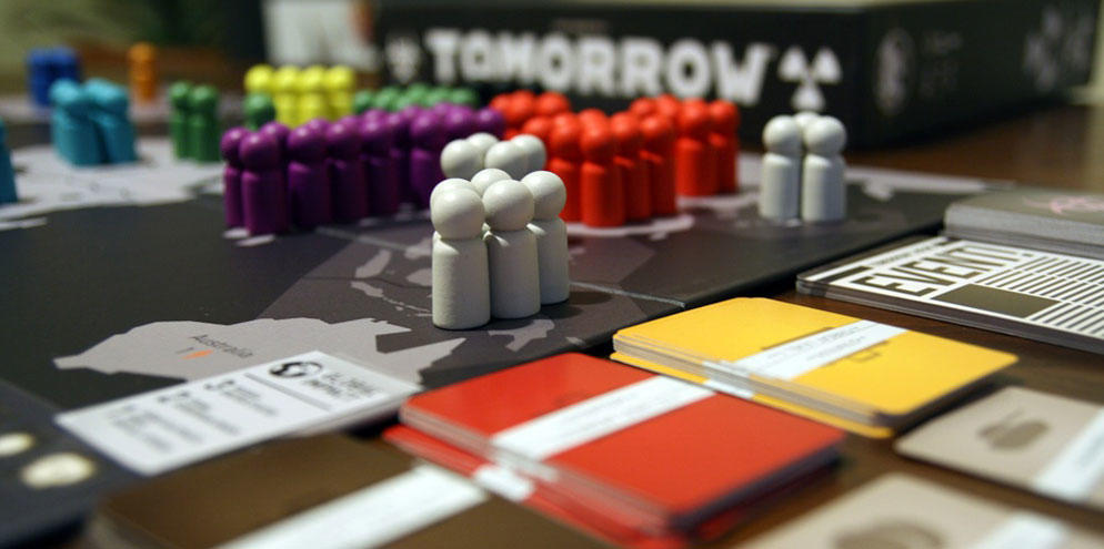
Graphic Design and Art: Heiko Günther
4-6 Players • Ages 12+ • 90 minutes to play • $40
So that’s my Top 10 Games with Great Design. Did I miss your favorite game? Let me know in the comments below.








Why not Mythomakya?
Anything by Red Raven Games is my #2. Ryan has a gift.
Tokaido will be my number one for everything.
Red Raven games is definitely an example of absolutely amazing artwork, but I would’t call it great graphic design. This list is more about creating a unified presentation of a unique look from box to board. Simply having awesome artwork isn’t enough.
I love Red Raven also but that is why City of Iron had layout changes in the Second Edition. There are faults in the layout of things he has made. But yes his artwork is stellar.
Arboretum, The Bloody Inn, Takenoko and Viticulture would be on my top too.
Great top!
I would add Tsuro and Mysterium. I love those ones also. But great selection for sure 🙂
Patchwork (except for the point system at the end of the game) is one of my favorite.. right after Tokaido and Flip City.
Quantum.
What about Quantum makes the design so great?
I’m really surprised Werewolves of Miller’s Grove isn’t on here. The artwork is so interesting and attractive!